LCA Education —
Compliance
Website
A new compliance website for LCA Education, designed and delivered in under four weeks. Built to meet UK regulatory requirements, structured for clarity, and developed with a mobile-first approach.
Challenge
A new regulation.
A site that didn't exist.
LCA Education needed a dedicated compliance website to meet new UK government regulatory requirements introduced in April 2026. The site needed to publicly surface key institutional documents — governance, policies, regulations, and partnerships — in a way that was accessible, navigable, and credible.
They came to me with a domain, a logo, a colour direction, and a list of pages. The structure, the design, and the decisions were mine to make.
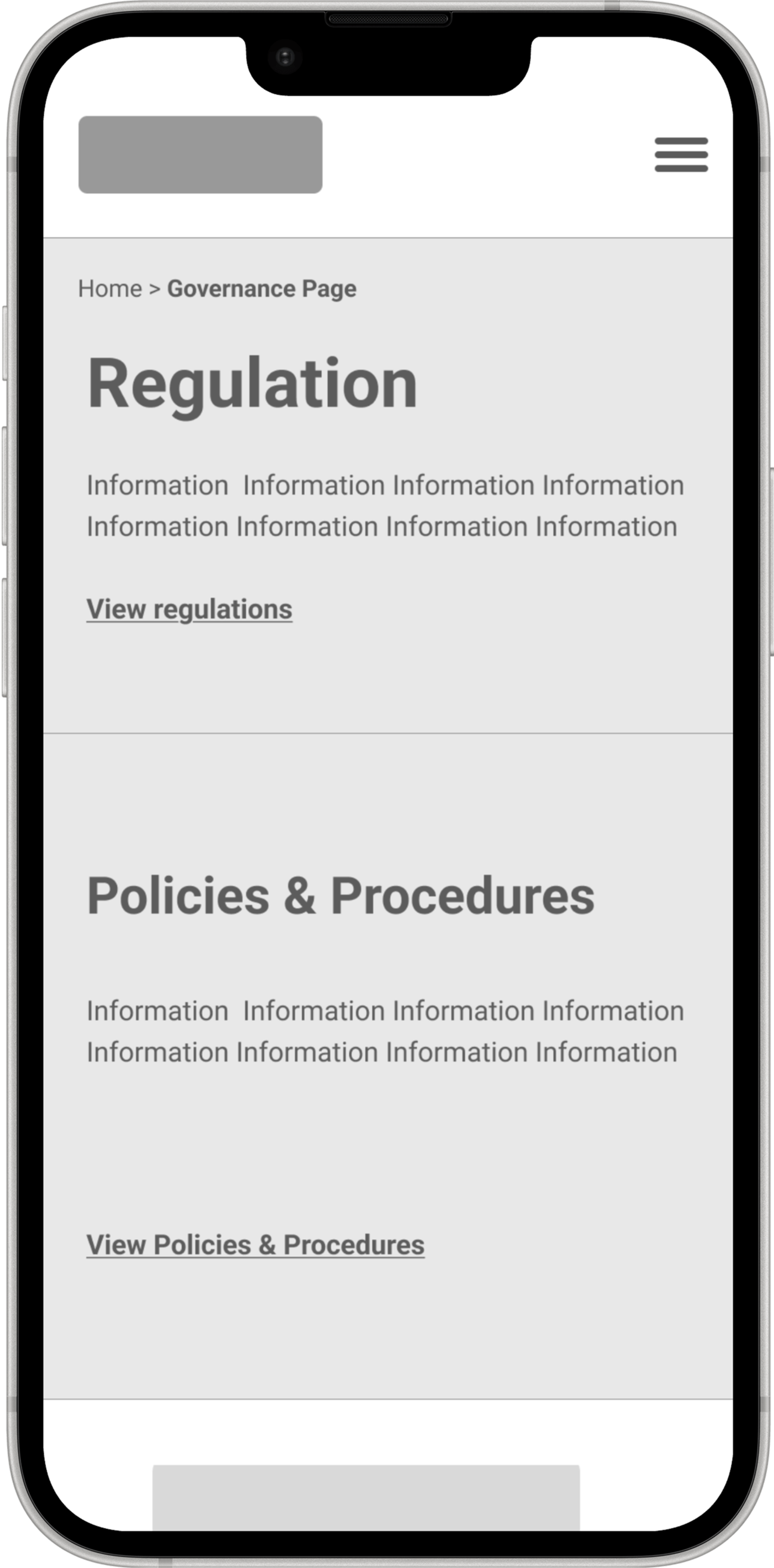
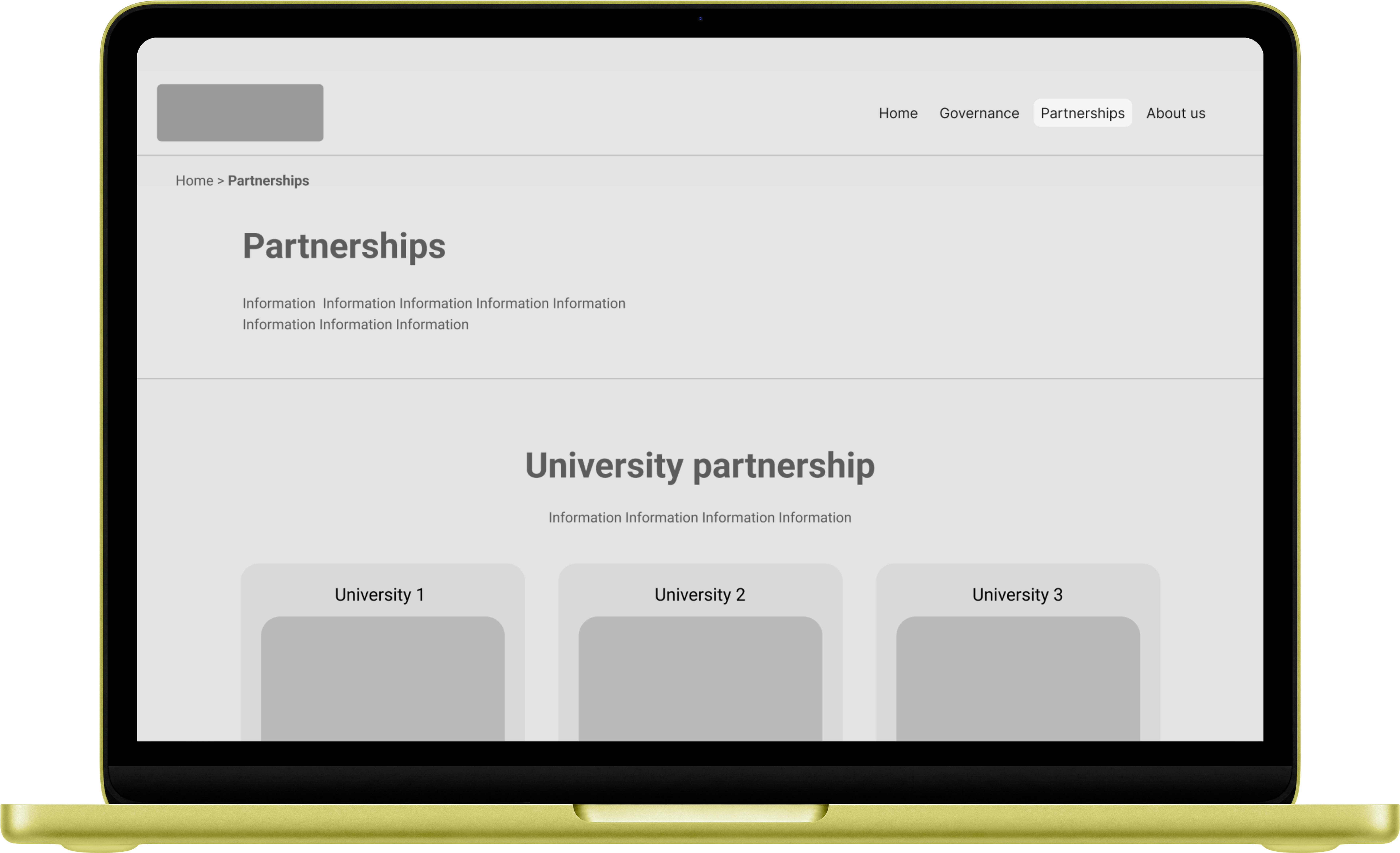
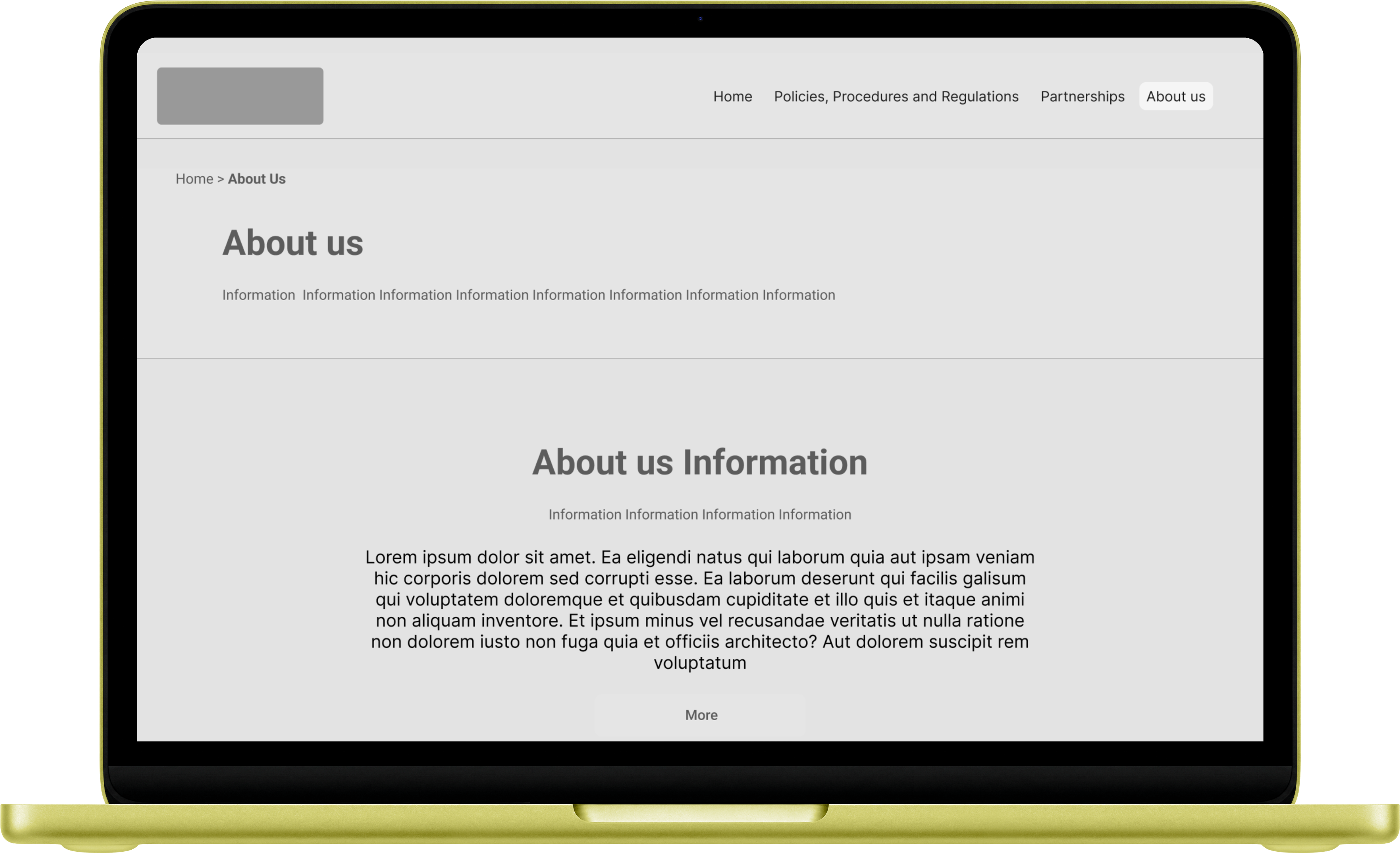
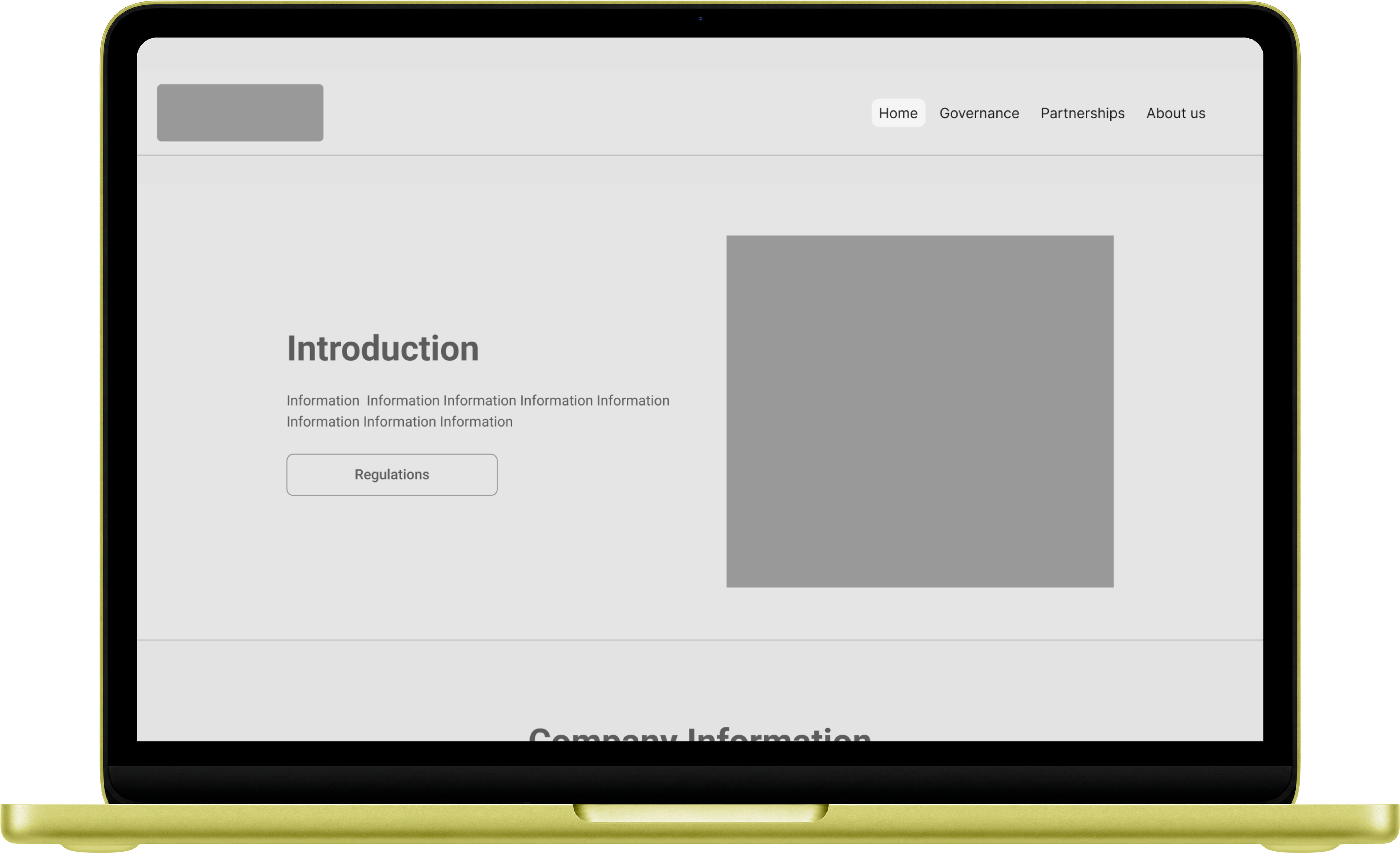
The brief covered eight pages: About Us, Meet the Team, Partnerships (UCLan and UoBM), Governance, Regulations, and Policies & Procedures. Each had different content types and different user needs — a governance page is not read the same way as a team page.
The target audience is primarily institutional — students, regulators, partner universities — so the design needed to carry authority without feeling cold.
Process
Research first,
then build.
Before touching a wireframe, I explored how similar institutions present compliance content. Oxford, Cambridge, and several UK higher education providers informed the structural decisions — how to handle heavy document pages, multiple navigation routes, and hierarchy across dense content.
Week 1
Research
Reviewed university compliance sites — Oxford, Cambridge, and others. Identified navigation patterns, document display conventions, and mobile behaviour.
Week 1
Structure & IA
Mapped the eight pages, defined content hierarchy, and proposed two colour directions from the brand guidelines provided.
Week 2
Low-fi Wireframes
Built low-fidelity wireframes covering all pages — desktop and mobile. Mobile-first approach throughout, with multiple navigation routes built in.
Week 3–4
Revision & Handoff
Two-week revision cycle with the client. Blue colour scheme selected. Final files handed to developer, built to allow content editing post-launch.
Design
Eight pages.
One coherent system.
Mobile-first
throughout
Every page was designed mobile-first. Compliance content is often accessed on the go — by students checking policies, partners reviewing governance documents. The mobile experience was not an afterthought.
- Touch-friendly navigation and document links
- Readable typography at small scale
- Stacked layouts that don't lose hierarchy on narrow screens
- Multiple navigation paths to the same content
Home
Governance
Policies
Desktop
structure
The desktop layout gave space to present institutional content with authority. Clear hierarchy, consistent spacing, and a colour palette that communicates trust without feeling corporate.
- Grid-based layouts adapted per page type
- Blue selected from two proposed colour directions
- Typography system consistent across all eight pages
- Developer-editable — content can be updated post-launch
Outcome
Designed, handed off,
going live this summer.
The full design was delivered within the agreed timeline and handed off to the development team. The site is built to allow the client to edit and post content independently. It is currently in development and expected to go live summer 2026 at lcaeducation.ac.uk.
4 wks
Brief to developer handoff, including revision
8
Pages designed across compliance, governance and partnership content
2
Colour directions proposed — blue selected
Also part of this engagement
UX Audit — Three University Websites